| Soils
Investigation Tests
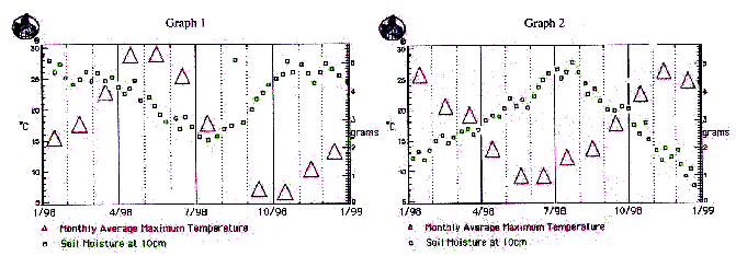
(Present problem
requiring use of GLOBE data archives) The Standard Weather
Service for North America recently collected the data in the
graphs shown above. The data shows temperature and soil moisture
information for the year 1998. However, due to a mislabeling
of files from an outside agency, the two graphs are for a
single site in North America - clearly a mistake. Since a
single site cannot have completely different readings for
the same time period, the correct data set must be determined.
The Standard Weather Service is in the process of preparing
their annual weather report for all the major cities in Canada,
Mexico, and the United States. You have been hired as a consultant
to a) determine which set of data is the correct set for the
site in North America and b) to help with the analysis of
the data.
1) (Interpret
GLOBE Data: Create multiple formats for representing data)
After collecting data, scientists often have to determine
the best way to view it - should they look at it in a data
table, in a line graph, or perhaps as a bar graph? Often,
they represent or show the data in a variety of formats. What
is one reason why you think scientists might want to have
several representations to look at? In this investigation
the data was presented in a line graph form. Using both graphs
1 and 2, make a table that shows the average maximum temperature
each month for the two sites. You should use the middle of
the triangles on the graph to determine temperature.
| Date |
Graph
1 temp (C) |
Graph
2 temp (C) |
| Jan
98 |
15 |
26 |
| Feb |
18 |
21 |
| Etc. |
|
|
|
|
|
|
|
|
|
|
|
|
|
|
|
|
|
|
|
|
|
|
|
|
|
|
|
|
|
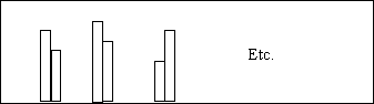
2) (Interpret
GLOBE Data: Create multiple formats for representing data)
To give yourself another way to view the given data, convert
the data table you made in question 1 into a bar graph. For
each month show one bar for graph 1 and another bar for graph.
3) (Interpret
GLOBE Data: Create multiple formats for representing data)
Scientists sometimes find it helpful to use the average of
a group of measurements instead of trying to analyze every
data point. This is sometimes called "cleaning the data."
What would be one reason that you can think of why a scientist
might want to do this? To try this out for yourself, make
a data table that shows the average soil moisture per month
for each graph.
| Date |
Graph
1 moisture (g) |
Graph
2 moisture (g) |
| Jan
98 |
4.7 |
1.9 |
| Feb |
4.5 |
2.3 |
| Etc. |
|
|
|
|
|
|
|
|
|
|
|
|
|
|
|
|
|
|
|
|
|
|
|
|
|
|
|
|
|
4) (Interpret
GLOBE Data: Infer patterns, trends) Scientists use their
different representations of their data to help them uncover
"trends" or patterns in the data. These trends often show
a relationship between several variables. For example, a scientist
might want to know if there is a relationship between temperature
and amount of rainfall in a certain region to help her understand
the plant growth in the area. What is a possible trend or
pattern that you see between the maximum temperature and soil
moisture when looking at the site 1 line graph? How about
for the site 2 line graph?
5) (Interpret
GLOBE Data: Infer patterns, trends) Repeat what you did
in question 4 but instead use the representations you created
in questions 1, 2, and 3 above. What trend or trends do you
see? Are they the same trends that you saw in question 4?
Which type of representation (line graph, data table, or bar
graph) was the most helpful in trying to see trends in this
data? Why?
6) (Plan Investigations:
Set up new problem) While analyzing data, scientists often
come up with reasons why they think there are certain relationships
between variables. Given the relationship you suggested in
the question above, what hypothesis might you make as to why
this is? How would you test your hypothesis? What additional
data from the GLOBE database would you need to help determine
if your hypothesis was correct?
7) (Taking GLOBE
Measurements: Errors are detected; use quality assurance)
Having collected data for the GLOBE database before, you know
that you have to be very careful and accurate when collecting
data. Look at the Site 1 graph. Are there any data that you
suspect might be due to a measurement error? How can you tell?
What would you tell someone who is collecting data to ensure
that this doesn't happen again?
8) (Interpret
GLOBE Data: Explain data & relationships) Looking any
of the data representations you have, which site seems like
it would be in North America? Why do you think so? What additional
data from the globe database might be useful to help you confirm
or disconfirm your hypothesis?
9) (Communicate:
Compose reports to explain or persuade) Using the data
analysis you have done, write a short report (1-2 pages) that
summarizes your findings and explains which data set fits
a site located in North America. Be sure to support your conclusions
with data you have analyzed.
|