| Visualizations
Investigation Tests
(Given
visualizations from the GLOBE data archives)


(Present
problem requiring use of GLOBE visualizations) During
a recent web chat with other GLOBE schools, a student
was confused as to why you have to take minimum and
maximum temperature measurements each day. "Why not
just take the temperature a few times on a given day
and average them together?", the student asked. One
of the GLOBE scientists who was part of the chat thought
it was an excellent question. "We should make an activity
about this!", she exclaimed.
In this activity
your goal is to analyze several GLOBE visualizations
and to report your findings on why maximum and minimum
temperature are part of the GLOBE database.
The GLOBE
visualizations contain many sub-elements that together
form a useful tool for uncovering patterns in GLOBE
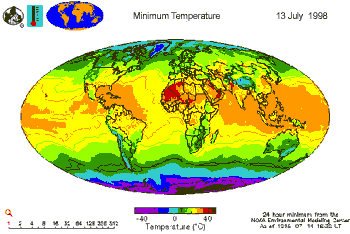
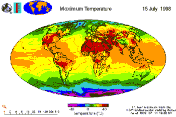
data. Above are two visualizations generated for the
same day. One is for the minimum temperature and the
other is for the maximum temperature.
1) (Plan
Investigations: Pose relevant questions) Pick one
of the GLOBE visualizations shown on the previous page.
Think of two questions you might ask regarding the visualization.
A sample question might be "What regions of the world
have the highest temperatures?"
2) (Plan
Investigations: Pose relevant questions) From previous
visualizations you have studied in your class, you've
noticed that the colors change as you go from one location
on the visualization to the other. Choosing one of the
visualizations given and starting at the bottom of it,
what trend(s) do you see regarding temperature as you
move to the top of the visualization?
3) (Take
GLOBE Measurements: Use quality assurance procedures)
A student in your science class, Tim, has collected
GLOBE data before and has always been very careful when
taking measurements. Are there any data in the images
that you suspect might be due to measurement errors?
How can you tell? What are some possible errors that
might occur in creating a visualization?
4) (Interpret
GLOBE Data: Explain data & relationships) In what
unit is the temperature given? Do you think the color
attribute that is used in the visualizations is appropriate
for representing temperature? Why or why not? Pick one
of the visualizations. What is the temperature range
for the Southern hemisphere?
5) (Interpret
GLOBE Data: Explain data & relationships) Pick three
countries on the visualizations that are on different
continents. What is the range in temperature for each
of these countries? Are the temperature ranges for the
countries you chose similar (within about15 degrees
of each other) or are they different? Explain you answer.
6) (Interpret
GLOBE Data: Explain data & relationships) Using
your answer to the question above, how do you think
the temperature range is related to its location on
the planet? For example, what could you say about a
country in the northern hemisphere when compared to
a country in the southern hemisphere or on the equator?
If you were given a visualization that had only average
temperature for the same day, would it provide more
or less information than having the minimum and maximum
visualizations? Explain you answer.
7) (Plan
Investigations: Set up another problem) Using the
GLOBE database, choose minimum and maximum temperature
visualizations for another date in 1998. Repeat questions
#5 and #6 above for these new visualizations, using
the same countries. How does help you support the argument
that it is important to study both maximum and minimum
temperature measurements?
8) (Communicate:
Compose reports to explain or persuade) Create a
10 minute presentation that supports the collection
and use of maximum and minimum temperature data. Be
sure to include what a visualization is, how you read
a visualization, and how you might find patterns in
the data. Use specific examples that you have from this
investigation to support you argument.
Answers will
vary but should include the specifics asked for within
the question, for example:
- definitions
of maximum temperature, minimum temperature, visualization;
- explanations
of using/reading a visualization, how to find patterns
in data;
- a clearly
stated argument for or against use of average vs.
max/min temperature data;
- use of
specific examples to support the chosen argument
|

